Creating a cohesive color palette can be half the challenge in any artistic project. Prior to Procreate 5, options for color inspiration were all outside the app. You would need to research and gather the colors, export an image, import it into Procreate, sample the colors and save them to a new palette.
But that’s not the case anymore.
[/vc_column_text][/vc_column][/vc_row]


Learn Calligraphy
on the iPad
from Scratch!
Create stunning calligraphy in Procreate with no experience or special tech skills (even if you have messy handwriting and don’t think you’re creative enough)
WATCH THE FREE WORKSHOPSince Procreate 5, we now have the tools to make clever color combinations without leaving the app!
Let’s look at how to harness the power of the color harmony tool to make appealing & interesting palettes.
Color Harmony
The Color Harmony tool helps artists quickly and easily choose harmonious color palettes to use in their work. It’s a simple, but incredibly helpful tool.
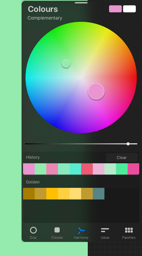
Under the Color Panel tab, you’ll see the ‘Color Harmony’ icon at the bottom menu. By default, the scheme is set to ‘Complementary’. You’ll notice if you tap on the ‘Complementary’ label, the drop down reveals several other schemes to choose from.
The color disc on this panel is more simplified than the normal version (without the outer ‘hue’ ring). You’ll see 2 little circles within the disc area and you can move one of these circles around and the other will move as well. This automatically gives you a harmonious companion color to your main sample. Note: colors will be more saturated towards the outer area of the disc and lighter towards the centre.
You can also adjust the brightness by using the slider located under the color disc.
Once you’re happy, tap on the color circle to active it.
As mentioned, there are 5 different schemes to choose from:
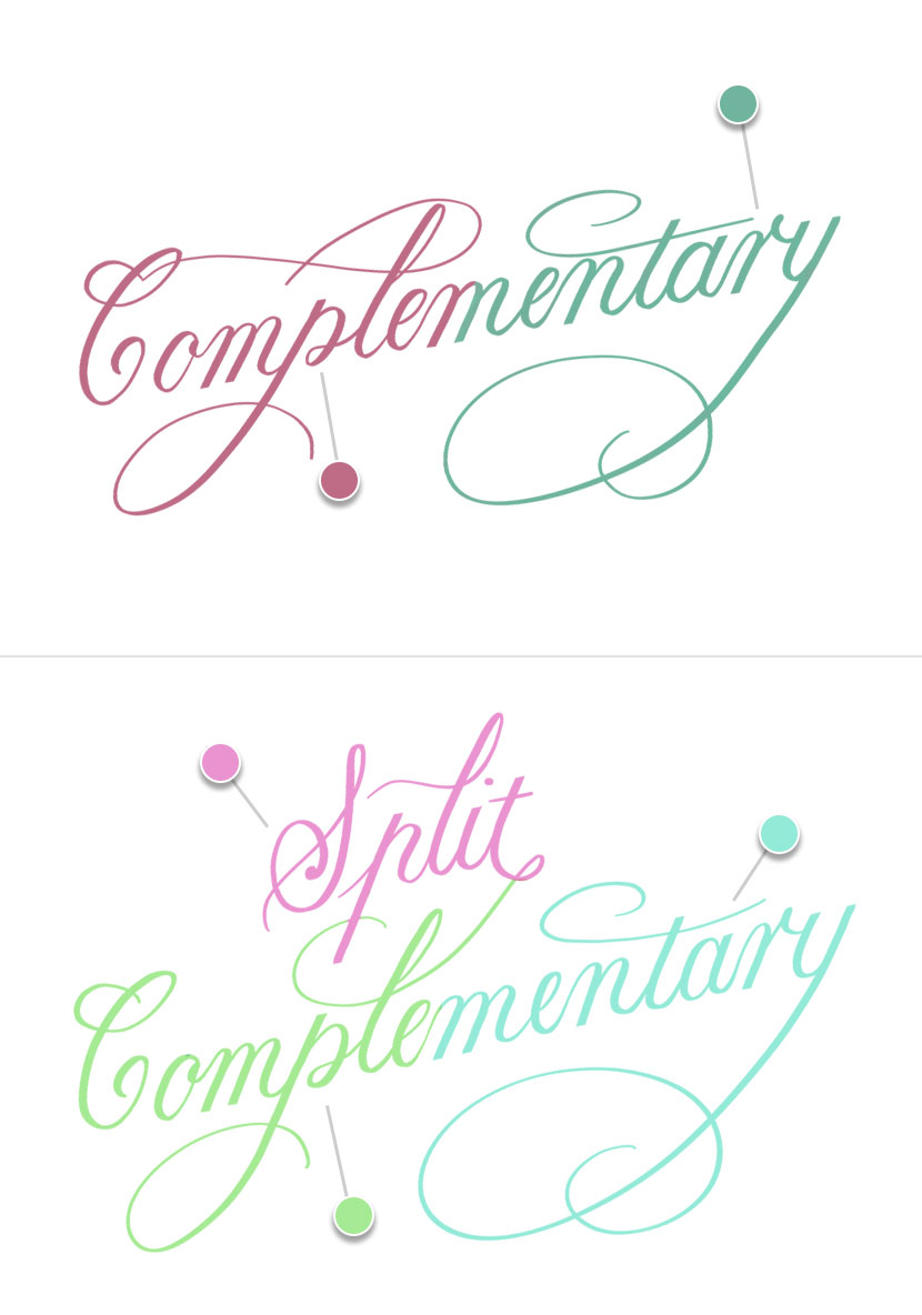
Complementary (2 colors)
Complementary colors are directly opposite each other on the color disc. When this scheme is selected, you’ll see your 2nd circle follow the first as you move it around, directly opposite. This will give colors with a high contrast.
Split Complementary (3 colors)
Split Complementary uses one main color and two secondary colors symmetrically opposite it on the color wheel.
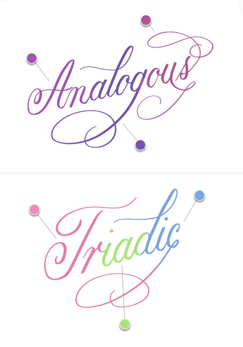
Analogous (3 colors)
An Analogous palette gives 3 colors that are very near each other on the color wheel. This has less contrast than complementary.
Triadic (3 colors)
A Triadic palette gives 3 colours that are evenly spaced on the opposite side of the color wheel.
Tetradic (4 colors)
A Tetradic scheme evenly spaces 4 colors on opposite side of the color wheel with no dominance given to any one color. It is very colorful scheme.

Color History
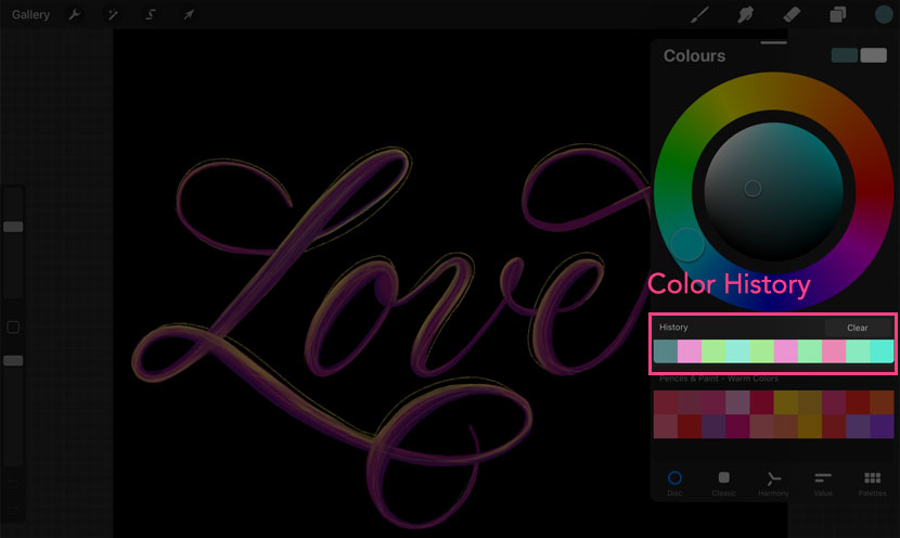
Color History was another helpful new addition. You’ll find it just under the color disc or main area of your color panel (it will appear on all color tabs apart from ‘Palettes’).
When you first open a new document the ‘History’ swatches will be empty. Then once you use a new color, the swatch is added to your ‘History’. It will hold your 10 most recently used colors. Very handy if you want to return to a previously color and haven’t been saving them as a palette. Sometimes it’s the little things that make all the difference!
Detachable Color Panel
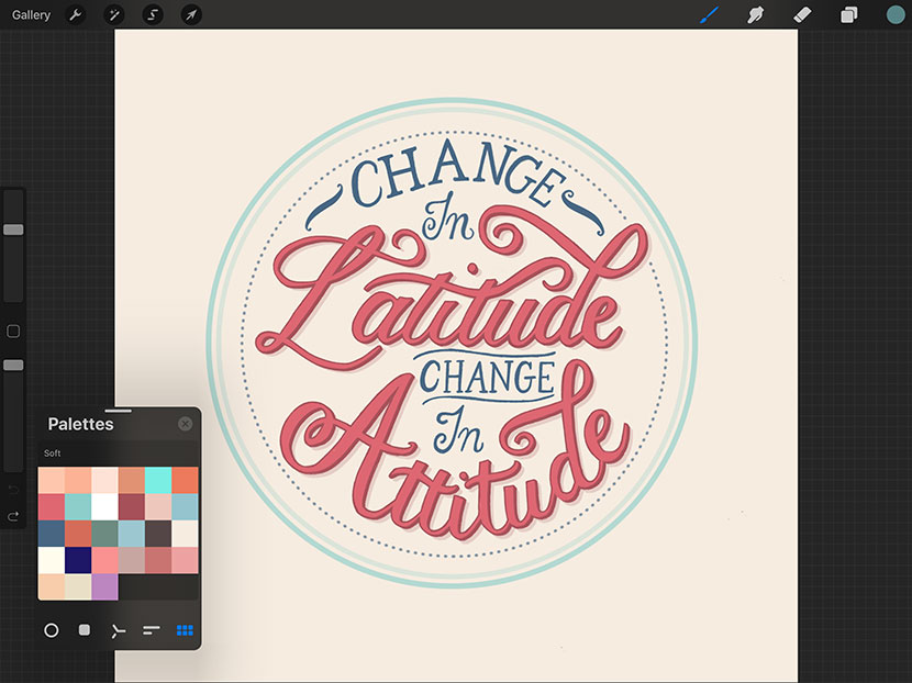
An interesting tweak to the UI, is the ability to detach the color panel. This allows you to place it anywhere on the canvas to keep visible at all times without having to open and close the color panel all the time.
Just simply pull from the little grey icon at the top of the panel to disconnect it, and you can then drag it anywhere on the screen.
Something tells me there may be more UI changes like this in future releases!
CMYK (print color profile)
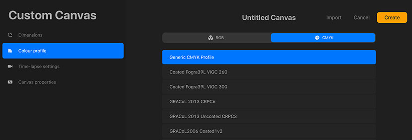
While we’re talking about color, we can’t leave out the fact you can now create artwork with a CMYK color profile (CMYK = Cyan Magenta Yellow & Black). This means you can artwork ready for print!
Previously if you wanted to print an artwork you had to use a 3rd party app in order to convert the color profile, but it’s now possible to use CMYK in directly Procreate.
There isn’t a way to change an existing RGB artwork into CMYK. You need to choose this in the initial document settings.
I hope that summary of the changes to color tools in Procreate 5 was helpful. Stay tuned for next week when we take an in-depth look at Brush Studio!
I’m sure you know by now, Procreate 5 was released at the end of last year and it was packed with incredibly useful features. Over the next few posts, we’ll be looking at these updates in more detail.
Today we start with Color.
Creating a cohesive color palette can be half the challenge in any artistic project. Prior to Procreate 5, options for color inspiration were all outside the app. You would need to research and gather the colors, export an image, import it into Procreate, sample the colors and save them to a new palette.
But that’s not the case anymore.


Learn Calligraphy
on the iPad
from Scratch!
Create stunning calligraphy in Procreate with no experience or special tech skills (even if you have messy handwriting and don’t think you’re creative enough)
WATCH THE FREE WORKSHOPSince Procreate 5, we now have the tools to make clever color combinations without leaving the app!
Let’s look at how to harness the power of the color harmony tool to make appealing & interesting palettes.
Color Harmony
The Color Harmony tool helps artists quickly and easily choose harmonious color palettes to use in their work. It’s a simple, but incredibly helpful tool.
Under the Color Panel tab, you’ll see the ‘Color Harmony’ icon at the bottom menu. By default, the scheme is set to ‘Complementary’. You’ll notice if you tap on the ‘Complementary’ label, the drop down reveals several other schemes to choose from.
The color disc on this panel is more simplified than the normal version (without the outer ‘hue’ ring). You’ll see 2 little circles within the disc area and you can move one of these circles around and the other will move as well. This automatically gives you a harmonious companion color to your main sample. Note: colors will be more saturated towards the outer area of the disc and lighter towards the centre.
You can also adjust the brightness by using the slider located under the color disc.
Once you’re happy, tap on the color circle to active it.

As mentioned, there are 5 different schemes to choose from:
Complementary (2 colors)
Complementary colors are directly opposite each other on the color disc. When this scheme is selected, you’ll see your 2nd circle follow the first as you move it around, directly opposite. This will give colors with a high contrast.
Split Complementary (3 colors)
Split Complementary uses one main color and two secondary colors symmetrically opposite it on the color wheel.

Analogous (3 colors)
An Analogous palette gives 3 colors that are very near each other on the color wheel. This has less contrast than complementary.
Triadic (3 colors)
A Triadic palette gives 3 colours that are evenly spaced on the opposite side of the color wheel.

Tetradic (4 colors)
A Tetradic scheme evenly spaces 4 colors on opposite side of the color wheel with no dominance given to any one color. It is very colorful scheme.

Color History
Color History was another helpful new addition. You’ll find it just under the color disc or main area of your color panel (it will appear on all color tabs apart from ‘Palettes’).
When you first open a new document the ‘History’ swatches will be empty. Then once you use a new color, the swatch is added to your ‘History’. It will hold your 10 most recently used colors. Very handy if you want to return to a previously color and haven’t been saving them as a palette. Sometimes it’s the little things that make all the difference!

Detachable Color Panel
An interesting tweak to the UI, is the ability to detach the color panel. This allows you to place it anywhere on the canvas to keep visible at all times without having to open and close the color panel all the time.
Just simply pull from the little grey icon at the top of the panel to disconnect it, and you can then drag it anywhere on the screen.
Something tells me there may be more UI changes like this in future releases!

CMYK (print color profile)
While we’re talking about color, we can’t leave out the fact you can now create artwork with a CMYK color profile (CMYK = Cyan Magenta Yellow & Black). This means you can artwork ready for print!
Previously if you wanted to print an artwork you had to use a 3rd party app in order to convert the color profile, but it’s now possible to use CMYK in directly Procreate.
There isn’t a way to change an existing RGB artwork into CMYK. You need to choose this in the initial document settings.

I hope that summary of the changes to color tools in Procreate 5 was helpful. Stay tuned for next week when we take an in-depth look at Brush Studio!
