It’s true that Digital calligraphy takes some getting used to!
There are a lot of similarities with traditional calligraphy, but the iPad screen is very different to paper, and the Apple Pencil is obviously not an oblique or brush pen! There are some aspects that need focus and awareness to get right.
There’s also the fact that not all brushes are created equal. There are settings for Procreate brushes that will effect how comfortable you feel and how smooth the brushstrokes will be. If you are used to a high streamline setting and suddenly use a brush with low streamline, you might wonder why your strokes look like you wrote while in the back of a taxi!
So today I wanted to share 7 mistakes that are easy to make when you’re starting out. Most are specific to digital, some are across both traditional & digital, but all need awareness in order to course correct and improve!
7 Common Mistakes
1. The right tool for the job
Just like you need the right tool in traditional calligraphy, the same goes for digital. You need a brush specifically designed for that particular style. Not only for the pressure sensitivity setting, but in the case of Copperplate, the thin strokes should be very thin and thick strokes not too thick! There is less contrast between the thick and thin than in another style (such as Brush Script). Procreate brushes have a maximum and minimum range for the pressure changes, so you need a brush that is designed to reflect the chosen style’s sizing.

The pressure changes in strokes are tricky for beginners to get to grips with no matter what tool you use – whether it’s pen & paper or screen and stylus! Using Copperplate Calligraphy as an example, the upstrokes are thin and the downstrokes are thick. This is due to the flexible nib on the dip pen – it expands when you apply pressure (on the downstrokes) and contracts when using a lighter pressure (for the upstrokes).
It can take awhile to get used to this and produce a gracefully taper (it should ease into the thickness change rather than a dramatic jolt). Rest assured, this is just part of the process though and will come with time and practice!
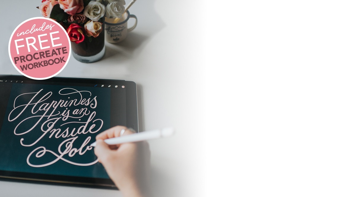

Learn Calligraphy
on the iPad
from Scratch!
Create stunning calligraphy in Procreate with no experience or special tech skills (even if you have messy handwriting and don’t think you’re creative enough)
WATCH THE FREE WORKSHOP2. Some letters don’t start or end where you might think they should
The letterforms in calligraphy are usually written with guidelines to keep them consistent in size and angle. Most letters sit on the x-height range and any descender loops start at the top of the x-height. There are a few letters that start slightly higher, or finish ¾ into the descender area.
An example of this is the lowercase ‘p’. The downstroke of the p starts a smidge above the x-height line. It can be easy for beginners to forget this and just follow the guidelines and start the downstroke on the x-height line like most other strokes, or finish the downstroke at the descender line.
There’s also the letter ‘t’. It starts slightly above the x-height as well. There are some letters you just have to get a feel for their edges rather than hitting them right on the guidelines. The grid will still help guide your placement.

3. Using the correct angle for the style
Different styles of calligraphy and lettering use different slants ie. Copperplate is written on a 55 degree angle, whereas Brush script is at a slant of around 20 – 30 degrees. Angle is also a big component to the style.
It can take some getting used to, but the guidelines will really help here as well.
It helps to have seperate image sheets of the guidelines that you can import into Procreate. Or better yet, paint the guidelines in any document by using a special guidelines brush like the one included in the Copperplate Guide, or the Essentials pack.

4. Trying to learn all the Procreate tricks, rather than deep diving into the style
This is definitely something I’ve experienced before many times – you start a new skill and it’s like a faucet opens and you start noticing all these other amazing things you could try! It’s tricky to stay on track, especially with digital calligraphy. At least with the traditional method, once you have all the tools out and your workspace prepped there is little to distract you. It’s just a matter of using the equipment in front of you.
But it’s not quite as easy with Procreate! You only have to glance at instagram and you’ll no doubt see a flood of fancy tricks you want to try out! But if you really want to learn, try to focus on honing your skill before diving into fancy effects. If you get really good at Procreate tricks and your base lettering is all over the place, you can’t cover that no matter how many Procreate effects you know!
5. Comparison paralysis
Looking at other people’s work you admire is by no means ‘wrong’. But if it starts overtaking your own confidence and self motivation, notice that’s happening and take a step back.
With so many people sharing their amazing skills on Instagram, it’s easy to see someones’s work, compare it to your own and think you could never create that. But you didn’t see how many hours they put in to get to where they are. And you probably haven’t seen their early work when it wasn’t so pretty. Don’t be afraid to start ugly. It’s got to be a bit of a mess at first, and being ok with that is the only way to improve and get better.

6. Not using a screen protector
A lot of people start digital calligraphy without a screen protector and find it difficult to get smooth strokes. But using one will definitely change your experience in a big way.
The iPad surface is made of glass and can be very slippery and difficult to control the pencil. It takes practice with the Apple Pencil to feel comfortable, but a big part of that is also having a screen protector. A good screen protector will give some friction, allowing more drag in the pencil and better control. I see a lot of people worried it might dim the brightness of the screen … it might do this slightly but not dramatic enough to be a big concern.
I use and recommend Paperlike (I am a partner with them and I love their product). It’s worth investing in a good protector – they will last you a long time and massively improve your pencil control.
7. Trying to learn several different lettering styles at once
This is a big one. And it applies to both traditional and digital calligraphy. When you first dive into lettering and calligraphy, it’s tempting to want to learn all the things, jumping around from style to style! I remember this feeling well. Every time I was instagram, I saw a different technique or style I wanted to try out. It’s driving by inspiration, which is great, but it can be detrimental to any real progress.
It took me awhile to realise this, but once I chose to focus on Copperplate and really learn that first, my skills improved a lot faster. It allows you to focus in and learn the subtleties that really make the difference to your work.
A lot of the rules of Copperplate cross over onto other styles as well, so it became a really helpful base to expand from. Even if you choose a different style, pick one to start with and deep dive into it. It will help you become a better lettering artist and give you an experienced eye to critique your own work from.
There are a lot of things to take in when you’re learning calligraphy for the first time. Especially on the iPad when Procreate is also new. But by sticking with it and carving out regular practice time, you will progress and move through the hurtles! Why not start your iPad Calligraphy journey today!
I am always here to help, just post any questions or comments below.
Darlene
Thanks for the great tips Nicole! I bought the Paperlike screen protector… I have had my iPad Pro 12.9” a long time, got it when they first came out… lol… still works fantastic, but the one screen protector I had in the past was just horrible. I am really looking forward to getting this one!! I do a lot of drawing and designing in my iPad… I’m unable to use it outside, the glare is too intense.
I’d never heard of Paperlike – so this tip is my favourite – this time!!
Hugs,
Darlene
Nicole Mauloni
Excellent Darlene, you won’t regret it! It’s definitely worth investing in a good screen protector and will make all the difference. Thanks so much for your comment!