Whether your time spent with letters is just for fun, or you are creating designs or typefaces professionally, you’ll definitely benefit from knowing the basic principles.
We’re so lucky to live in a time where many people share their knowledge. Gone are the days when you need to spend thousands on education. You just need a bit of time, determination and an internet connection.
But as I mentioned, determination … it is up to you!
Understanding the correct terminology will help you develop your knowledge as a lettering artist at a much faster pace. Being able to decipher key terms pushes your skills to the next level. It is important to be able to articulate your subject with your fellow designers as well.
Style Names
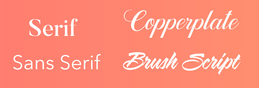
Below are some broad top level groups for distinguishing different styles of typography or lettering. There are further classifications, but these will help you determine what general category a style fits into.

Letter Proportions and Guidelines

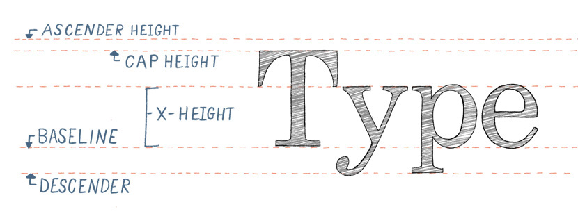
The above image shows the proportions for letters themselves and the names for the guidelines.
As you might expect, all letters align to the Baseline. Uppercase letters hit the ‘Caps’ line and most lowercase letters are contained within the X-height, such as a, c, e, i etc. (It’s called the x-height because the lowercase x will determine the size of this area).
Letters with ascenders (b, d, h, k etc) may differ slightly depending on style. Some styles will extend all the way to the ascender line, while others have the ascenders only reach the caps height.
Another example is the lowercase ‘f’. When written in a script style, the stem often extends to the descender line. If written in as a serif, the stem most likely finishes at the baseline.
Letterform Anatomy
The below graphic shows more specific definitions for individual parts of the letters, or in other words ‘letter anatomy’.

Stem : The main vertical stroke of a letter
Tail : The descending stroke on the letter Q or R and g, j, p, q and y.
Counter : The counter is the either partially or fully enclosed space of a letter.
Descender : The portion of letters that extends below the baseline.
Ear : A small element that extends from the upper corner of the g or r.
Loop : The enclosed counter below the baseline such as the double storey g.
Terminal : a curved ending to a letter.
Ascender : The portion of lowercase letters that extends above the x-height.
Bowl : The enclosed round part of a letter.
Shoulder : A curved part of the letter that extends from the stem.
Serif : The small detail attached to the end of a stroke.
We’ve covered the most common terms you are likely to come across. The website is a good reference for further study.
Next time you hear someone referring to the ‘stem’, you’ll know exactly what they are talking about and can avoid saying anything awkward about flowers.
