Why do people say ‘lettering’ in some instances, and ‘calligraphy’ in others? Are they not the same thing? And what about typography, where does that fit in?
You’ve probably heard the terms ‘hand lettering’ and ‘calligraphy’ interchange a lot, but have you ever wondered what the real difference is? If you are involved in typographic arts, whether it’s just a general interest or a more professional role, it’s important to know the different subcategories and use the right term for the scenario.
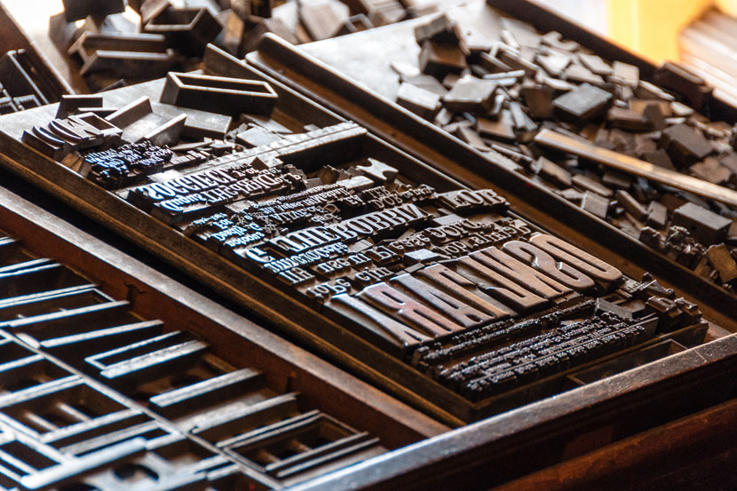
Typography
Let’s look at Typography first as it is the most distinct of these three categories. A definition from this article, describes typography as:
“the style, arrangement or appearance of typeset matter”.
Typography is a repeatable system allowing for endless combinations of words. The typeface you are reading on your screen now was created by someone with the intention of giving the user the ability to communicate anything they choose, supplying a complete set of characters in the alphabet (even possibly multi-language support). Typography gave us countless ways to design information.

Unlike typography, Lettering and Calligraphy are a custom approach to a composition. Hand crafted solutions can often solve design problems and convey emotion giving a more human feel to the work. It might not be immediately obvious to the viewer that someone drew or wrote each letterform by hand, but there’s something they can usually recognise as being ‘different’ and more authentic.
There’s a lot of subtleties which can blur the lines, but basically it comes down to this : Lettering is the act of ‘drawing’ words. Calligraphy is the act of ‘writing’ words.
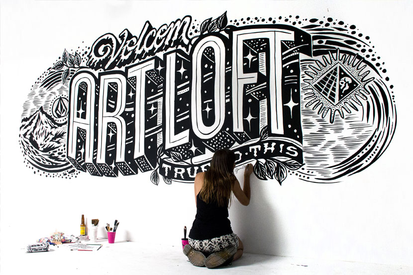
Lettering (or Hand-Lettering)
Lettering artists can create a piece in a variety of ways. They may draw the skeleton of the letterforms, building the form as they go. They may paint one letter at a time moving the position of components to get a better visual balance. They may even draw the main spine of a cursive script, and then fill out the thick strokes letter by letter (also called faux calligraphy). Lettering isn’t always based on traditional styles and can often break the rules creating contemporary pieces.
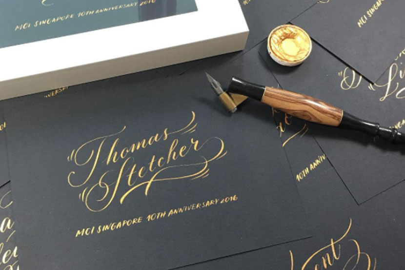
Calligraphy
The word Calligraphy means ‘beautiful writing’. It comes from the greek words kallos “beauty” + graphein “to write”. That gets us somewhere, but is still a bit obscure.
Dutch typographer and author Gerrit Noordzij, defines calligraphy like this :
“Calligraphy is writing – a single pass of the pen/tool to write as a form of art” (source)
With modern tools that simulate traditional, his mention of ‘single pass’ is helpful.
It can be particularly confusing when lettering is based on a traditional script style such as Copperplate or Round Hand. Does that then mean it’s actually calligraphy? According to Gerrit Noordzij’s definition, no. Calligraphy isn’t a term for the style or aesthetic itself, but for the method of producing it.
Learning Calligraphy opens up valuable knowledge for anyone wanting to create Lettering. Understanding where thick and thin strokes naturally sit, on what side of the letter and why. It gives you the basis for good balance of visual space and an understanding of letter construction .
It might seem academic, but is important to understand and respect the different terms especially if you are doing it professionally and communicating with clients. It is often tricky to tell if a piece is the result of Lettering or Calligraphy, but knowing the difference when creating your own work is key.
Choosing one doesn’t mean you can’t practice the other. Quite the opposite. They compliment each other! You will find your own style and method for getting the effect you need and often the output of the final piece could impact the process you choose.


