This article is the follow up to a previous video I made about converting your RGB artwork into CMYK using Procreate. When would you want to convert your artwork’s colour mode? See the video or read below to find out.
Why would you want to convert artwork to CMYK?
CMYK actually stands for Cyan, Magenta, Yellow, Black. It’s the color mode for printing. So RGB actually means Red, Green, Blue, and it’s a digital format. Whenever you want to print out your artwork you need to be in CMYK mode.
Obviously, it’s always a good idea to set up your document with the right settings to begin with, but more often than not creativity strikes and before you know it you’ve made an amazing design that you want to print out but you realize you created it in RGB color mode and it needs to be in CMYK.
Unfortunately, it’s not as easy as just the click of a button to change color modes in procreate. Which is what that original video is all about. I take you through a workaround for converting colour modes without leaving Procreate.

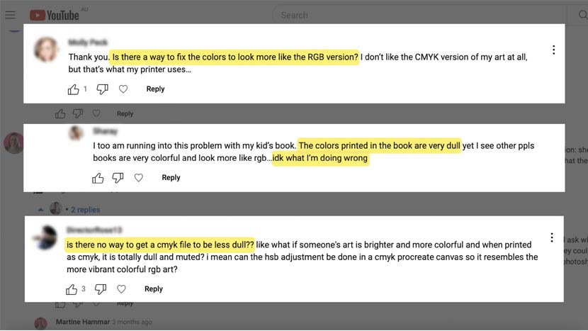
That first video got a ton of comments and questions from people saying that their artwork was now looking dull and muted after the conversion. They were asking for help on how to improve this and make it more like the original RGB version.
Well, I have a solution for that but before we get there, I want to point out that’s completely normal.
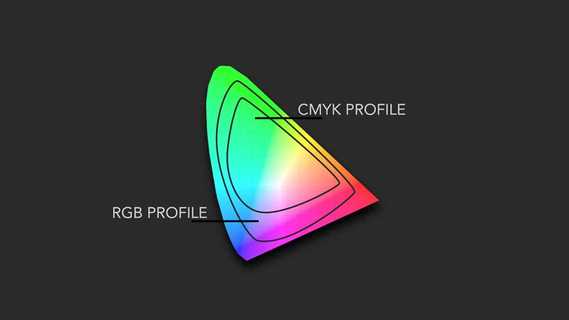
There are less colours in CMYK
The CMYK color profile isn’t as diverse as the RGB profile. It has a different range of colors that represent what a printer can actually reproduce. It’s a section of the RGB spectrum. The RGB palette is more diverse. So it’s to be expected that you’ll see a difference in vibrancy after the conversion.

File Format is important too!
Another thing that’s important to mention is it matters what file format you choose to export your converted CMYK file in. JPEG and PNG are digital formats and not actually a good choice for CMYK. If you’re working in CMYK I recommend that you export your file in a PSD format so it will preserve the colors accurately and also won’t compress any file information either.
Professional printers will accept PSD files (as well as your home printer), and you’ll also be able to preview the artwork in your Photos app on your iPad as well.
If you want to know more about file types so that you know which are best to choose for different purposes, there is a free cheat sheet you can download below.
OK, so how do we brighten the CMYK colours?
We can open back up the PSD file with the CMYK colors (the one we created in that first video, let’s call it part 1).
I’m going to make a duplicate version of the layer first so that we’re not overwriting the original and we can compare it later as well. Just go to the layers menu (2 little squares) and slide your layer thumbnail to the left, choose ‘Duplicate’.
Note: something else that could be a good idea to do before you get into the color tweaking is to check the brightness of your iPad. Mine is set to about 70 – 80% which is bright enough without oversaturating.

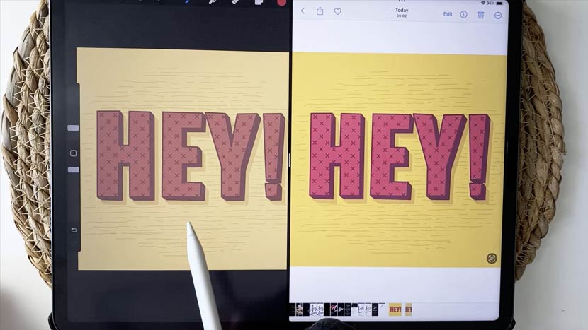
As you can see from the image above, there’s quite a big difference in the colors between the CMYK version and the original RGB version.
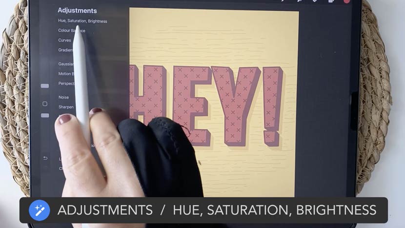
Go to your adjustments menu here, you can choose ‘Hue, Saturation and Brightness’. This setting allows us to adjust the vibrancy of the colors.
We can increase the Brightness and the Saturation here and play around with those settings. The Hue will change the color time completely so that is probably not what you want. Be careful not to go too far though because you don’t want to oversaturate the colors.

Another good one that you can play around with is ‘Curves’. You’ll find it back in the ‘Adjustments’ menu. Set the top button to ‘Gamma’ and that will strengthen all the channels equally giving you a brighter image overall.
Once you’re done and you’re happy with the image you can compare it with the original version to see the improvements you’ve made, then export it again as a PSD file.
Every interaction counts!
If you enjoyed this video, please comment, like or share. That is the best way you can support content creators like me for free.
Thanks so much and see you next time!

Robby Cook
Thanks very much, Nicole, for another GREAT and very helpful video! Much appreciated … Robby Cook