Only recently, I discovered the power of planning your instagram grid. I’ve heard of the concept before, and it’s obvious when people put effort into coordinating their feed. But for some reason, I never attempted to do this myself … until now.


Learn Calligraphy
on the iPad
from Scratch!
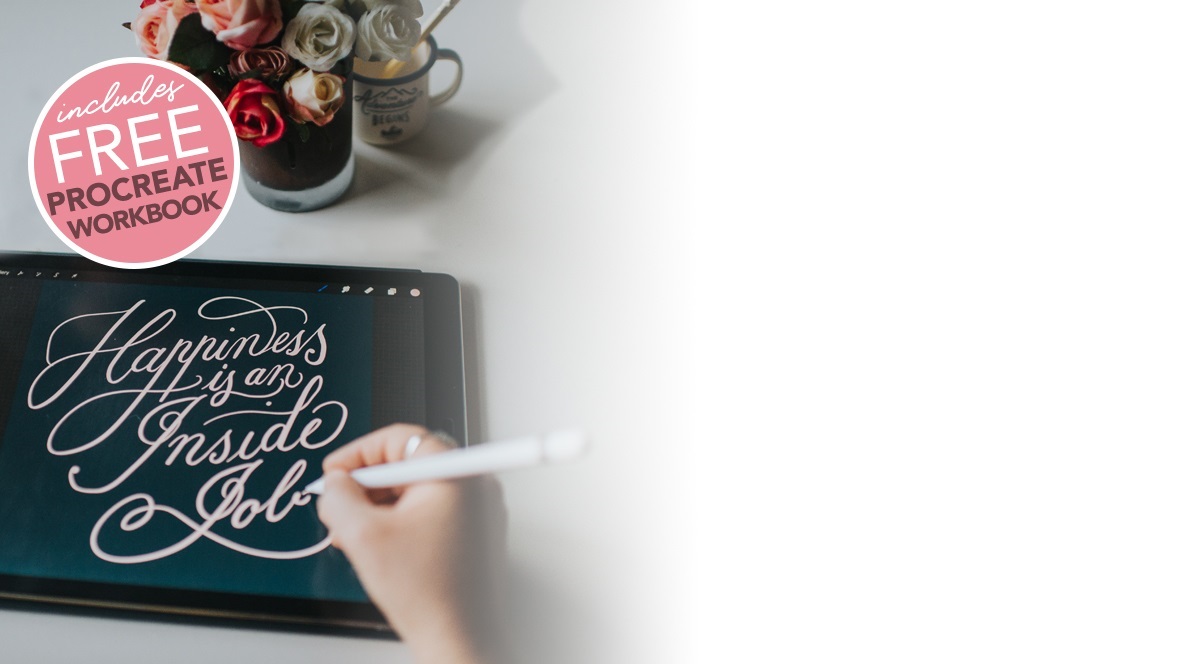
Create stunning calligraphy in Procreate with no experience or special tech skills (even if you have messy handwriting and don’t think you’re creative enough)
WATCH THE FREE WORKSHOPI’ve always kept a written list of post ideas, but I’m very visual person (as I’m sure most of you are too), and since implementing this new method, I’m finding it a much more inspiring way to plan my feed.
There’s a sense of relief knowing the content for several posts in advance, as well as satisfaction allocating cohesive colours to the little grid boxes in the template. It removes that dreaded ‘blank canvas’ feeling you get looking at an empty screen. Not only does it make for a slicker looking profile, but it helps bring to life the look and feel of your brand, giving an overall view of the style and themes you are creating.
I thought this could be useful for you too, so I created a free Instagram Grid Planner template for Procreate to share with you today. I realise a lot of people don’t have access to a desktop computer and Photoshop, so having a template like this for Procreate is handy, especially when you’re already in the app creating lettering for instagram!
Download and Import the Template
Click here to download the Procreate File only
Click here to download the Procreate File + PSD version (for Photoshop)
The above links will take you to a Dropbox Folder containing the file. You don’t need a Dropbox account in order to download. You’ll see one of two screens:
The file icon on the page with ‘Open in Files’ and ‘More’. Tap on ‘More’ and choose ‘Open in’ and choose Procreate.
Or otherwise you’ll see 3 dots at the top right corner. Tap these, then ‘Export’, ‘Open in’ and choose Procreate.
It will import the file to your Procreate Gallery.
How to use the Instagram Planner Template
Please note: The purpose of this template is to plan your instagram content and colour palette using small thumbnails. The squares representing each post are a lot smaller than your image size needs to be in order to post high quality images on Instagram. You’ll need to create the actual full sized images separately. Tip: I tend to plan my layout using the small thumbs, create the large image, and then replace the thumb with a scaled down version of the large post image.
The Layers
When you open the layer palette, you’ll see several layer groups representing each grid square. They are labeled 1 – 12 starting from the bottom right (the same way your feed would work). I would suggest filling up the grid in this order so it will appear as it would on your live instagram feed.
When you tap the little arrow and expand a layer group, you’ll see the ‘Grid Size’ layer and a ‘Draw Here’ layer within each folder. The ‘Grid Size’ layer allows you to change the background colour of that square so you can work on an overall colour palette for your feed.
The ‘Draw Here’ layer is incase you want to sketch up a little drawing or lettering layout. If you happen to go outside the square, it will be hidden by the mask (which is already set up).

Designing a Colour Palette
If you like to use a mix of photos and solid backgrounds, it can be helpful to set up a colour palette for your grid squares. You don’t need to strictly stick to it, but it’ll help you keep things cohesive.
To change the colour of the individual grid squares, pick the colour you want to use in the top colour circle, then tap the layer called ‘Grid Size’, and choose ‘Fill Layer’ from the menu dropdown. (The layer transparency is locked so you can easily fill the layer in this way).
Importing Photos and Images
You can import your own images and size them down to fit in your square grid boxes. It will be easier if you stick to a square ratio image so they are proportional with the grid when you scale them down.
If you want to mask imported images, just use ‘Grid Size’ layer as a reference for the square block size. To do this, tap on the ‘Grid Size’ layer and choose ‘Select’ from the drop down menu. Then highlight the layer you want to hide the overflow on, and choose ‘Mask’. Everything outside the selection will be hidden.
So hopefully you will find this template helpful for planning and designing your own instagram feed.
Another surprising benefit I’m finding from doing this is, I’m thinking more on the topic I’m posting about. I use a companion text file with my grid template for the post descriptions. Once the thumbnail design is locked in, the idea ticks over in my mind and I make notes in the text file. I think more deeply about the message of the post than if I’d just spontaneously come up with the idea on the same day.
I wasn’t really expecting it to go any deeper than a visual improvement, but there you go! Maybe the same will happen for you. I’d love to find out – let me know by leaving a comment below.