One question I see asked a lot is ‘what side of the letter do I put the thick strokes’?
A feature that distinguishes Copperplate Calligraphy is ‘contrasted’ or ‘shaded’ strokes. Certain parts of the strokes are thicker and other parts are thin. New students can easily get confused where to place the thicker strokes.
You may have seen someone’s work before and instinctively knew something was off. Chances are the thick strokes were on the wrong side. Even if you haven’t learnt calligraphy before – we are so used to seeing type and script lettering, you might not be able to pinpoint the exact problem, but just know something is wrong.
Don’t worry though, you don’t need to memorise the thick placement in every letter. Once you understand the reason for the contrasted strokes, it’s easy to remember and you’ll be able to visualise where they should go.
I’ll also talk about how this all relates to digital calligraphy of course as well!
Which side do the thick strokes go?
It’s not a matter of ‘putting the thick strokes on the left’. While it can seem that way, when you look closely you’ll notice some letters have have thick strokes on both sides, for example the lowercase ‘g’ or ‘h’. So what is the consistant rule here?


Learn Calligraphy
on the iPad
from Scratch!
Create stunning calligraphy in Procreate with no experience or special tech skills (even if you have messy handwriting and don’t think you’re creative enough)
WATCH THE FREE WORKSHOP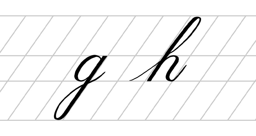
First, we need to look at the original tools used to create Copperplate. Traditionally, Copperplate is made with a flexible nib pen and ink. When you apply pressure, the nib expands to its broadest point, filling that wider area with ink which creates thicker strokes. When you ease on the pressure, the nib contracts again and makes a thin stroke. We use a heavier pressure for the downstrokes and a lighter pressure for the upstrokes, so therefore – downstrokes are heavy & thick, and upstrokes are light & thin!
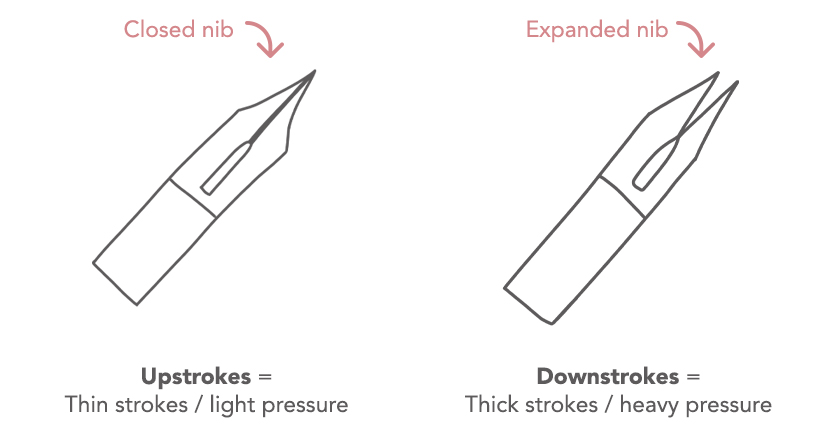
If you have practiced with the Copperplate iPad workbooks before, you’ll remember our mantra – ‘light pressure upstroke, heavy pressure downstroke’ throughout the guide. This is to remind you where and when to apply pressure, producing those thicker strokes.
Another advantage to knowing this information is it can help you figure out how a letter is written. If you look at the stroke start and end, you can tell the direction the pen travelled from the thickness of the stroke.
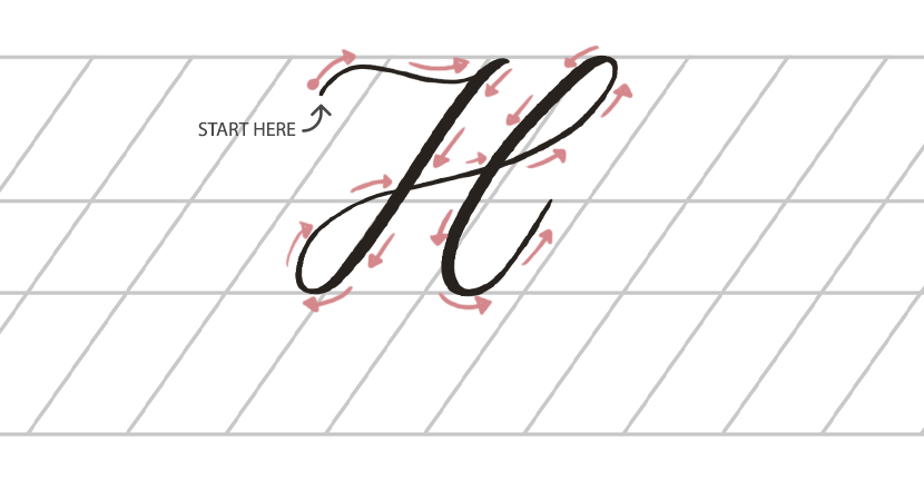
For example, take the letter ‘H’ below – the stroke on the left is thin, so it must have been made with a light pressure. That also tells us the direction must have been an upstroke. Therefore the stroke started on the left and moved to the right into a downstroke using heavy pressure and then following the curve around etc.
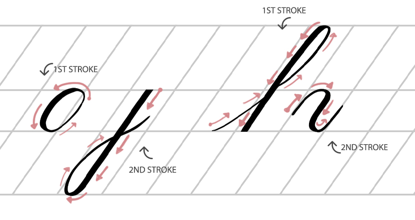
While the pen pressure and direction answers most of this question, something else comes into play. More often than not, a single letter is made up of two strokes (sometimes more). You need to know how those strokes are separated in order to know how they are made (that’s where the Copperplate Guide comes in – it show the components for both lowercase and uppercase letters!).
Overlapping Strokes + Pressure Change
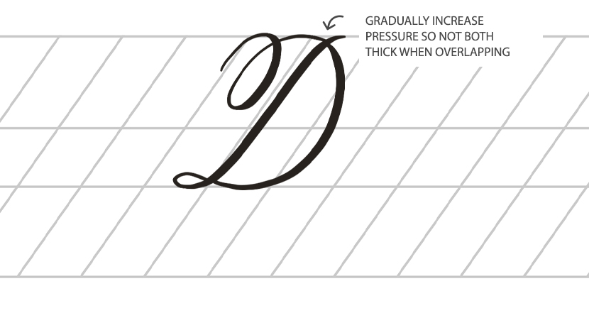
There are subtleties with this general rule to keep in mind. For instance, in some letters the stroke overlaps just as they are changing into a thicker stroke, such as the Uppercase ‘D’. It is important to taper the thickness gradually in this instance and make sure the overlapping strokes aren’t both thick.
What about Flourishing?
What about Flourishing? Flourishing diverges from the rules slightly. You can still apply the same principles in a lot of cases – using a heavier pressure for the downstroke, and light for the upstrokes. But it’s a lot less obvious where the dowstrokes and upstrokes are in flourishing. The swashes bend and sway in different directions.
So you can think of it like this : Two thin strokes can overlap, a thick and thin stroke can overlap, but two thick strokes must not. This keeps an elegance and grace to the script, but more importantly, legibility.
If in doubt use a light pressure for your flourishes. It will always look graceful and ensures you keep to that rule of not overlapping thick strokes.
Is iPad Calligraphy different?
While the Apple Pencil is a very different tool, we use the pressure changes in the same way – downstrokes use a heavy pressure and upstrokes use a light pressure.
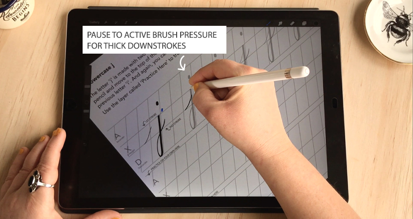
And just like traditional calligraphy, it helps to pause at first contact with the iPad screen for full pressure strokes in order to activate the pressure settings for the brush. The reason for this when using a dip pen is to open the nib to it’s broad state, and likewise with digital – you want to activate your pencil on its full pressure setting before starting the downstroke. Otherwise you’ll get a taper leading into stroke, and we don’t want that!
So next time you are trying to work out which side the thick stroke is, imagine writing the letter in your mind. Think about the direction of the pen travels and you will be able to visualise the correct stroke weight.
I hope you enjoyed this article. If you would like to learn more about Copperplate on the iPad, sign up to the free Starter Kit series below.

Luciana Olivier
Your posts are so useful and clear! Even for a non English speaker!! Thanks for sharing you knowledge!!
Nicole Mauloni
Thank you so much Luciana! Really pleased to hear they are easy to understand 🙂
Thomas Devenney
Hi Nicole,
You did a great job with your new work space. Looks pretty cool!!
Really enjoying the lessons! Really appreciate it!!
Kind Regards,
Thomas in Belfast, Northern Ireland
Nicole Mauloni
Hi Thomas, Thanks so much. It was actually really fun to do a bit of DIY! Glad you are enjoying the iPad calligraphy lessons 🙂