Did you know the human eye can distinguish about 10 million different colours? Makes you head spin doesn’t it? I don’t know about you, but I have difficulty picking harmonious colour palettes for lettering (even with 10 million to choose from). I used to think it didn’t matter. That the work itself would speak for itself, even in black and white. Don’t get me wrong, I love using black and white a lot of the time, but I came to discover that colour combination is a very powerful tool. It can grab attention and express emotion to the viewer instantly.
You could spend a lot of time learning colour theory. There are countless websites and studies solely devoted to it. But there is a much simpler way. There are plenty of free online tools that make picking the perfect colours quick and easy.
First I’ll show you five of my favourite places for colour inspiration that each bring something unique, and we’ll then go through a simple way to save these palettes to use in Procreate.
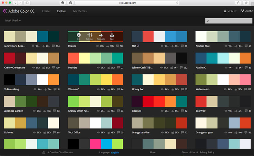
Previously know as Adobe Kuler, this is web app lets you create, browse and save colour palettes. You don’t need to be a Creative Cloud subscriber to use it, but if you are, you have the advantage of exporting palettes straight into Photoshop or Illustrator.
When you first get to the site you’ll see the colour wheel with different settings to create your own palette. This is great but we are looking for inspiration, so just click on the ‘Explore’ tab to see the pre-made palettes. You can then filter these by ‘Most Popular’ and ‘Most Used’. You can also enter a keyword in the search bar at the top left to find themed palettes.
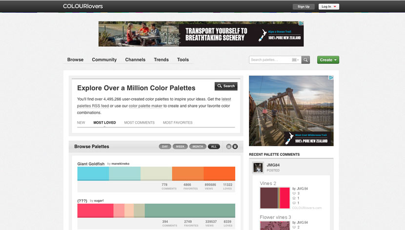
Originally created by the folk at Creative Market, Colour Lovers is another great resource for palette inspiration. It extends beyond colours and also has ‘Pattern’ and ‘Shapes’ sections as well.
You’ll see a ‘Browse’ button in the top navigation. Rollover this and select ‘Palettes’ from the drop down menu. You can then use the filter options below to sort by New, Loved, Commented and more.
The search feature is really handy too. You’ll seen a box you can enter the HEX value of a specific colour you would like to include, and it will show any shared palettes that contain it. You can also do a more general search by using the ‘Hue’ options where you can search for a colour by name.
The ‘Trend’ section shows a feed of colour schemes in branding and photography which give you an idea of how these palettes are used.
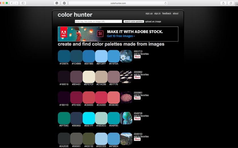
Color Hunter is slightly different to the first two options. You can still browse through a gallery of saved palettes, but it’s main feature is you are able to generate a custom colour palette based on an uploaded image. Click on ‘Upload an image’ link at the top of the site and upload a .gif, .jpg or .png of the image you want to sample. It will then generate the values of the main colours used.
This comes in handy if you are using photography in your lettering work, or if you just like the tones in a particlar image.
Note: There seems to be a browser issue using this site on Safari. Try using a different browser like Chrome, for Firefox if you have any trouble.
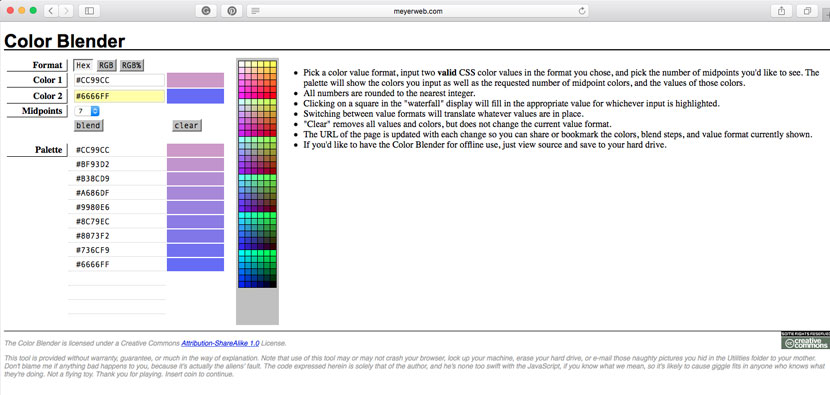
As the name suggest, Color Blender is a simple web app for a generating the tones between two colours.
Simply choose two different colours and specify how many mid points (or steps) you want between. Color Blend then generates these graduation values for you. Very handy!
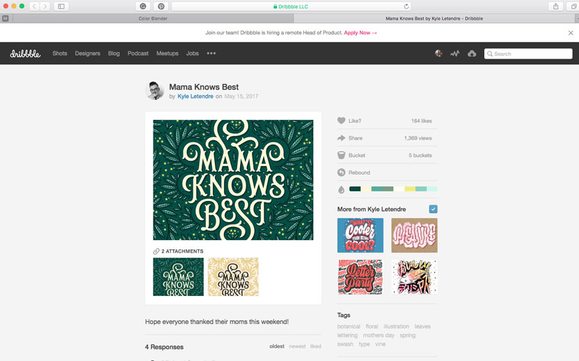
While Dribbble isn’t intended purely as a colour resource, a special feature of the site is it automatically generates colour swatches for user’s posts. It’s like you’re getting two for one – great design inspiration as well as colour palettes.
By clicking on any of the individual colours in the swatch group, you can also search for other work based on that colour.
If you are a Photoshop user, you can download an .aco file and import the palette.
Save your Colour Palettes in Procreate
Now we have our colour inspiration, let’s look at how you can save those values in Procreate to have on hand for your next Lettering project.
[psst.. this part has been updated to show you the best, latest way since Procreate made color palette collection SOOOOO much better with version 5X].
Anything I see that I like, I take a screenshot and save in the reference folder. To screengrab from your Mac computer, press cmd Shift 4. To screengrab on your iPad, press the ‘Home’ button and ‘power’ button. Or if you have a fancy newer iPad that doesn’t have a home button, simply press the top button and the volume up button at the same time. Volia! I like to keep a swipe folder on Dropbox (or iCloud, you do you) called ‘colour-reference’ and save my grabs in there.
Next, open Procreate and either go into an existing document or create a new one.
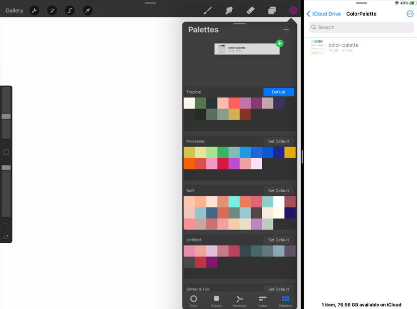
Now, pay attention, this bit is a bit fiddly to demo, but WELL worth it for your future efficiency. Pull up from the bottom of your screen and you’ll reveal your icon dock. Tap and hold the ‘folder’ icon (this is a shortcut for the ‘files’ app which is the gateway to your…. files). Hold and drag and you’ll see you can slide that baby to the right of your screen, giving you a split screen view of BOTH apps at the same time. (If you’re rolling your eyes right now, remember, not everyone knows this exists. Patience!)
In the Procreate window, open your color panel by tapping the color circle in the top right, and make sure the ‘palettes’ tab is open (using the icon at the bottom of the panel).
Next you want to use the files app window to navigate to your saved color palette grabs. Ok, this is where the magic happens. Tap and hold your color reference image thumbnail from your files app and DRAG it into your palette panel and you’ll see a space magically appear allowing you to drop your image into that area. WOW, see that?! Procreate has created swatches from your image!! So so cool and useful huh?!
You now have a quick reference to your favourite colour combinations! If you want to share these palettes, it’s as simple as swiping to the left and clicking ‘Share’. You can then save the file to Dropbox and send it to whoever you wish.
LIz
Wow, an utterly brilliant article, Nicole, thanks so much! 🙂
Nicole Mauloni
Thank you! So pleased you enjoyed it Liz 🙂
Alicia
Awesome thank you so much! This was something I was wondering about!
Nicole Mauloni
Glad it was helpful Alicia, thanks so much for saying.
Josee
Thank you! I appreciate all that you share here on iPad Calligraphy!
Nicole Mauloni
My pleasure Josee. Very happy to hear you like the site.
Laura
Thank you 😍😍😍😘 from Italy.