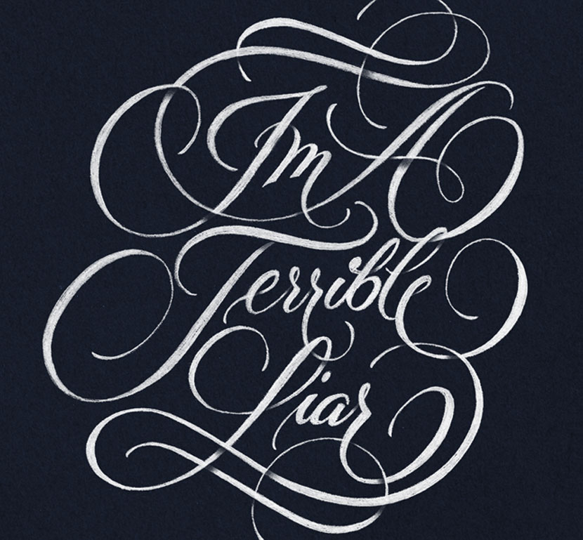
Before I knew what to call them, flourishes had drawn me into the art of Lettering and Calligraphy. I remember filling notebooks with random swirls when I was a teenager. Who knew it would be good training for flourishing letters later on!
Flourishes and swashes can be used in a number of different ways from dramatic and flamboyant waves to subtle connections between letters. Graceful swirls lead the eye into the design and bring a layout together. They one of the key elements that make lettering feel so expressive and custom made. I’d even go so far as to say they reveal an artist’s personality and add to their own unique style.

What are Flourishes
Flourishes can be extensions to a letterform as well as decorative elements in their own right. The elements and shapes connect letters threading through a design. Flourishes are commonly used :
- On the exit or entrance stroke of a letterform
- At the beginning or the end letter in a word
- To extend the ascender or descender of a letter
- As enhancement or extension of a crossbar
- As decorative swirls and curves around the artwork
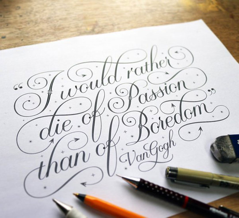
Tips for Good Flourishes
Flourishes definitely add interest and flair to a piece, but if overused it can be distracting and reduce readability so it’s important they compliment your work and not take away from it.
Match the size and flow of a flourish with the style of the lettering. For example, if you have airy and graceful curves, tiny little loops and swirls won’t be the best match! In most cases, the proportion should be larger than the letters themselves with a generous amount of white space between. This avoids having a large clump of detail in one area. Try to create harmony to the look overall.
Start with the whole word or layout and add flourish afterwards. You will have a better sense of where to place ornaments that enhance the work. Try to look for large gaps of white space and add flourishes to balance the piece out.
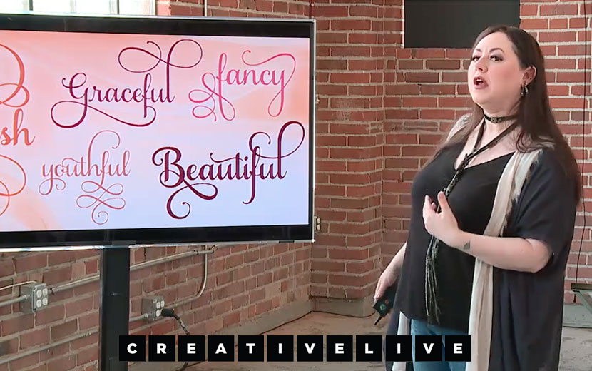
Where to Find Inspiration
There is so much inspiration for flourishes on instagram! Some artists that often use them in their work include, Ryan Hamrick, Colin Teirney and Seb Lester to name a few.
Laura Worthington is a Typeface and Lettering Designer from Washington State and she is a flourishes queen!
Laura has a fantastic Flourishes with Brush Lettering class available on Creative Live that goes very in depth. I’ve done this course myself and found it really informative and hands on. There are downloadable practice guides included too.
Open Type Fonts
Another great source of inspiration for flourishes and swashes is Open Type Script Fonts. They contain a hidden set of ‘glyphs’ you can access that provide a whole other set of options for upper and lowercase characters.
This is great for designers, but why is it relevant to custom lettering? It’s an easy way to quickly test a layout especially when you’re just getting started with flourishes. Most Open Type fonts provide 3 or 4 different options for a letter to chose from. Some with the swashes on the top, bottom, to the left or the right. By creating a mockup you can quickly get a feel for how the flourishes can best work together. I’m not saying you should copy the form exactly, but it might offer ideas you hadn’t considered that you can incorporate into your work.
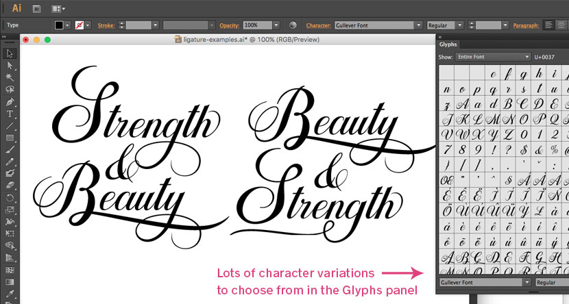
To reveal the extra characters in an Open Type Font, just choose ‘Glyphs’ from the Type menu in Illustrator. You can then select the letter you want to change and choose another variation. For more information on doing this on a mac, click here. We can also do this directly on our iPad using Affinity Designer.
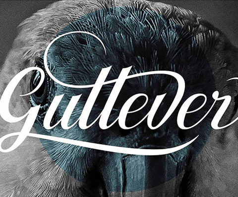
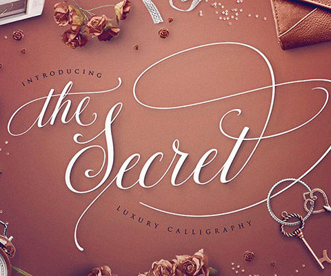
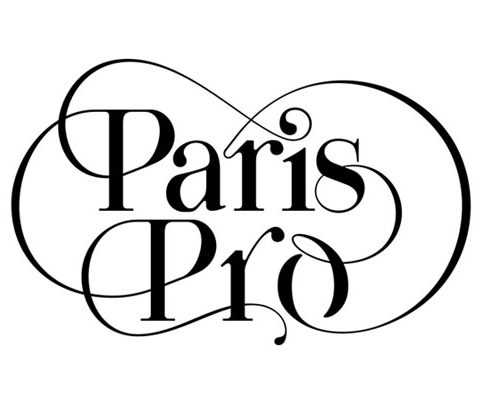
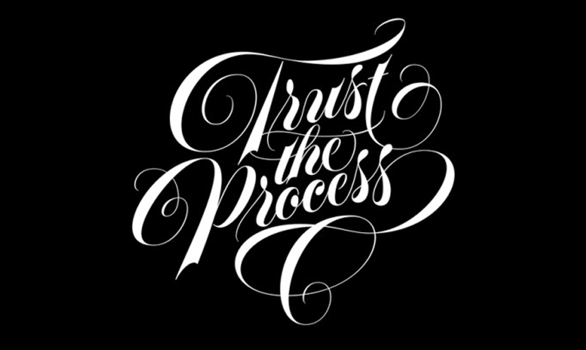
There are many Open Type Fonts that include these special glyphs. Most of them will showcase the extra characters and swashes available on their website so you can see if it’s the sort of style you are after. A few examples of some lovely Open Type Fonts shown below.